
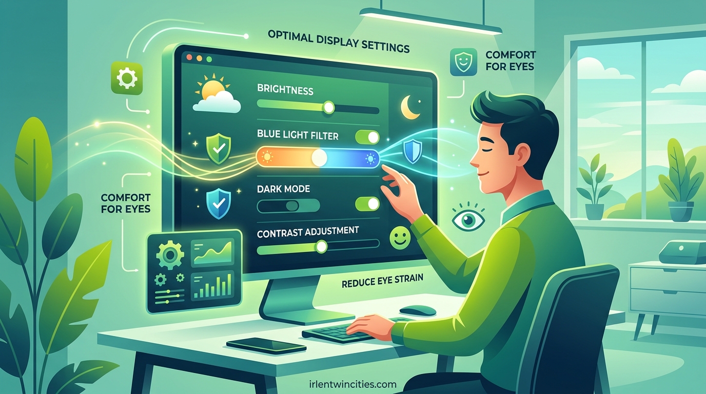
Your eyes weren’t designed for eight hours of daily screen time, yet that’s exactly what most of us face. I spent years dealing with persistent eye strain, headaches, and that gritty, dry feeling that comes from staring at monitors all day. After consulting with optometrists and testing dozens of setting combinations across multiple devices, I’ve identified the specific adjustments that actually make a difference.
The best screen settings to reduce eye fatigue focus on five key areas: matching your screen brightness to ambient light, adjusting color temperature throughout the day, optimizing contrast ratios, selecting appropriate refresh rates, and maintaining proper viewing distance. These changes can reduce digital eye strain symptoms by up to 60% when implemented together.
In this guide, I’ll walk you through each setting with specific numbers you can use immediately. Whether you’re on Windows, Mac, iPhone, or Android, these recommendations will help you work and play more comfortably.
Table of Contents
Understanding Digital Eye Strain
Digital eye strain, also called computer vision syndrome, isn’t just tired eyes. It’s a collection of symptoms including dryness, blurred vision, headaches, and neck pain that stems from prolonged screen use.
Your blink rate drops significantly when you focus on screens. Normally, you blink 15 to 20 times per minute. When staring at a monitor, this drops to just 5 to 7 blinks per minute. Less blinking means less moisture, leading to dry, irritated eyes.
Blue light exposure affects your circadian rhythms, especially during evening hours. While research on permanent damage is ongoing, the immediate effect is disrupted sleep patterns. Poor sleep then compounds eye fatigue the following day. Additionally, many monitors use PWM (pulse-width modulation) to control brightness, creating invisible flicker that triggers headaches in sensitive individuals.
Quick Settings Reference
If you only have five minutes, make these changes now:
- Brightness: Set to 15-25% in dark rooms, 30-50% in typical office lighting
- Color Temperature: 6500K during daytime, 2700-4000K after sunset
- Contrast: 70-80% for most work
- Refresh Rate: Use 75Hz minimum, 120Hz or higher if available
- Distance: Position screen at arm’s length (20-26 inches)
- Breaks: Follow the 20-20-20 rule (explained below)
These settings serve as your baseline. The following sections explain why each matters and how to fine-tune for your specific environment.
Brightness and Ambient Light
The most common mistake is running your screen too bright. Default monitor settings are almost always too high for typical room lighting, forcing your eyes to work harder than necessary.
The paper matching technique offers a simple test. Hold a white sheet of paper next to your screen. Adjust brightness until the white on your display matches the white of the paper. This ensures your screen isn’t brighter than your surroundings, which is the primary cause of contrast-related eye fatigue.
Recommended brightness levels by environment:
- Dark room: 10-20% brightness
- Typical office: 30-50% brightness
- Bright room with windows: 50-70% brightness
Bias lighting makes a significant difference. Place a light source behind your monitor that matches your room’s color temperature. This reduces the contrast between your bright screen and the dark wall behind it. Many users report immediate relief after adding LED strip lighting behind their displays.
Color Temperature and Blue Light
Color temperature, measured in Kelvin (K), determines how warm or cool your screen appears. Lower numbers (2700K) produce warm, yellowish light. Higher numbers (6500K) produce cool, bluish light that mimics daylight.
Daytime work benefits from cooler temperatures between 5500K and 6500K. This keeps you alert and maintains color accuracy for design work. After sunset, shift to warmer temperatures between 2700K and 4000K. This protects your circadian rhythm and reduces blue light exposure when your body expects darkness.
Every modern operating system includes automatic blue light reduction:
Windows: Night Light settings allow scheduling temperature shifts from sunset to sunrise.
macOS: Night Shift performs the same function and integrates with your location.
Third-party option: f.lux offers more granular control than built-in tools, allowing specific Kelvin adjustments and disabling for color-sensitive work.
One forum user reported that lowering their RGB values from 100/100/100 to 90/90/85 eliminated their persistent headaches. Small adjustments to individual color channels can significantly impact comfort for sensitive users.
Contrast and Text Settings
Contrast ratio affects how hard your eyes work to distinguish text from background. Set contrast between 70% and 80% for general use. Pure 100% contrast creates harsh edges that cause fatigue over time.
Text size matters more than most people realize. Set your minimum font size to 12pt, with 14-16pt preferred for extended reading. Use your operating system’s scaling features rather than just zooming in browsers. This ensures all interface elements remain readable.
Enable font smoothing tools appropriate for your platform:
- Windows: Run the ClearType Text Tuner to optimize for your specific display
- macOS: Font smoothing is enabled by default, adjustable in System Settings
Avoid pure white backgrounds when possible. Cream or light gray backgrounds reduce harsh contrast while maintaining readability. Many applications now offer “eye care” or “reading mode” that applies these colors automatically.
Refresh Rate and Flicker
Refresh rate determines how many times per second your screen updates. Standard displays run at 60Hz. Upgrading to 120Hz or 144Hz can reduce perceived flicker and eye strain, particularly for sensitive individuals.
However, refresh rate isn’t the full story. PWM (pulse-width modulation) flicker causes more problems for some users than low refresh rates. PWM rapidly turns the backlight on and off to control brightness. At lower brightness settings, this flicker becomes more pronounced.
If you experience headaches that worsen as the day progresses, PWM sensitivity might be the cause. Look for flicker-free or DC dimming monitors that adjust brightness without rapid cycling. Many manufacturers now advertise this feature specifically.
To test your current monitor, use your phone’s camera. Point it at your screen and observe through the viewfinder. Visible bands or lines indicate PWM flicker. Some people are highly sensitive to this invisible flicker while others notice no difference.
Dark Mode vs Light Mode
The dark mode debate has no universal answer. Each mode excels in different conditions.
Dark mode helps in low-light environments and on OLED displays where black pixels emit no light. It reduces overall brightness and can extend battery life on mobile devices. Many programmers and night workers prefer it for these reasons.
Light mode performs better in bright rooms and for reading comprehension tasks. Dark text on light backgrounds reduces halation, the spreading of light around bright objects on dark backgrounds. This creates sharper text edges that are easier to focus on.
Your best approach is situational switching. Use light mode during daytime work in well-lit rooms. Switch to dark mode for evening sessions or when working in dim environments. Let your comfort guide the decision rather than following trends.
Display Type Considerations
Not all screens affect eyes equally. The panel technology matters for sensitive users.
IPS LCD panels generally cause less eye strain than OLED for extended work sessions. OLED displays use pulse brightness that fluctuates based on content, which triggers discomfort in some users. The subpixel arrangement on OLED can also create text clarity issues at certain distances.
However, individual response varies dramatically. Some users cannot tolerate OLED at all, while others find it more comfortable than LCD. Panel lottery refers to manufacturing variations where two identical model monitors can have different backlight behaviors.
Matte versus glossy coatings also impact comfort. Matte coatings diffuse reflections and reduce glare at the cost of slight sharpness reduction. Glossy screens look vibrant in controlled lighting but create harsh reflections in bright rooms. For eye comfort, matte finishes generally win unless you have complete control over room lighting.
Platform-Specific Settings
Here’s how to implement these recommendations on your specific devices.
Windows 11
Night Light: Settings > System > Display > Night Light. Enable scheduling or manual activation. Use the intensity slider to adjust warmth.
HDR Calibration: If using HDR, run the HDR calibration tool to prevent excessive brightness in standard content.
ClearType: Search “Adjust ClearType text” in the Start menu. Follow the wizard to optimize for your display.
Scaling: Settings > System > Display > Scale. Set to 125% or 150% on high-resolution monitors.
macOS
Night Shift: System Settings > Display > Night Shift. Enable automatic scheduling from sunset to sunrise.
True Tone: System Settings > Display > True Tone. This adjusts color temperature based on ambient sensors. Turn off for color-critical work.
Display Profiles: System Settings > Display > Color Profile. Use the calibrated profile rather than default for better accuracy.
iOS and iPhone
Night Shift: Settings > Display & Brightness > Night Shift. Schedule for sunset to sunrise at a warm setting.
Auto-Brightness: Settings > Accessibility > Display & Text Size > Auto-Brightness. Keep enabled so your screen adjusts to current lighting.
Display Zoom: Settings > Display & Brightness > Display Zoom. Use Zoomed mode for larger interface elements.
White Point: Settings > Accessibility > Display & Text Size > Reduce White Point. Lower this to 70-80% to reduce overall brightness without affecting contrast.
Android
Blue Light Filter: Settings > Display > Blue Light Filter or Night Mode. Schedule for automatic activation.
Extra Dim: Settings > Accessibility > Extra Dim. This reduces brightness below normal minimums for dark room use.
Font Size: Settings > Display > Font Size and Style. Increase beyond default for comfortable reading.
Screen Resolution: Settings > Display > Screen Resolution. Lower resolution can increase element size, reducing strain.
Physical Setup and Positioning
Settings only go so far. Physical setup completes the comfort equation.
Maintain arm’s length distance between your eyes and screen, approximately 20 to 26 inches. Position the top of your monitor at or slightly below eye level. This creates a 15 to 20 degree downward gaze angle, which reduces exposed eye surface area and minimizes dryness.
Reduce reflections by positioning your screen perpendicular to windows. Use blinds or curtains to control natural light. Matte screen protectors help on glossy displays that can’t be repositioned.
Multi-monitor setups require special attention. Angle side monitors inward toward you rather than placing them flat. This reduces neck turning and maintains consistent focal distance across all screens.
Break Reminders and Eye Care Habits
Even perfect settings cannot overcome marathon sessions. Your eyes need breaks.
The 20-20-20 rule is the standard recommendation. Every 20 minutes, look at something 20 feet away for at least 20 seconds. This relaxes your focusing muscles and reminds you to blink.
The 10-10-10 rule offers an alternative for intensive work. Every 10 minutes, look at something 10 feet away for 10 seconds. This suits programmers and writers who lose focus with longer breaks.
Conscious blinking exercises help retrain your habits. Every hour, deliberately blink 10 times slowly. This spreads moisture across your eyes and provides relief from accumulated dryness.
Several apps enforce these breaks: EyeCare 20 20 20 for mobile devices, Stretchly for desktop computers, and Awareness for Mac. These interrupt your work briefly but save significant discomfort later.
When to See a Professional
These settings help most people, but they aren’t a substitute for professional care.
Schedule an eye exam if you experience persistent symptoms despite optimizing your setup. An optometrist can check for underlying conditions like dry eye syndrome, uncorrected astigmatism, or focusing problems that settings cannot fix.
Computer glasses with specific prescriptions for your working distance can provide significant relief. Blue light filtering lenses may help some users, though research remains mixed on their effectiveness.
Trust your body. If symptoms persist, worsen, or include pain rather than discomfort, seek medical evaluation promptly.
Frequently Asked Questions
What is the best monitor setting for tired eyes?
The optimal settings include brightness at 15-25% in dark rooms or 30-50% in office lighting, color temperature at 6500K during daytime and 2700-4000K in the evening, contrast at 70-80%, refresh rate at 75Hz or higher, and maintaining arm’s length distance from your screen.
How to reduce eye fatigue from screens?
Implement the 20-20-20 rule by looking at something 20 feet away for 20 seconds every 20 minutes. Match screen brightness to ambient light, use blue light filters in the evening, increase text size, maintain proper viewing distance, and take regular breaks to blink consciously.
What is the 10 10 10 rule for screens?
The 10-10-10 rule is an alternative to the 20-20-20 rule for intensive computer work. Every 10 minutes, look at something 10 feet away for 10 seconds. This provides more frequent breaks for users who experience strain during focused tasks like programming or writing.
Is 60 or 120 Hz better for eyes?
120 Hz is generally better for eyes than 60 Hz as it reduces perceived flicker and creates smoother motion. However, the benefit varies by individual. Some users experience significant relief at higher refresh rates, while others notice minimal difference. PWM flicker matters more than refresh rate for sensitive users.
Does dark mode reduce eye strain?
Dark mode reduces eye strain in low-light environments and on OLED displays. However, in bright rooms or for reading comprehension tasks, light mode often performs better. The best approach is situational switching based on your current lighting conditions and tasks.
What brightness level is best for eyes?
The ideal brightness depends on your room lighting. Use 10-20% in dark rooms, 30-50% in typical office lighting, and 50-70% in bright rooms. The key is matching your screen brightness to ambient light using the paper matching technique: adjust until screen white matches a sheet of white paper held beside it.
How far should my monitor be from my eyes?
Position your monitor at arm’s length, approximately 20 to 26 inches from your eyes. The top of the screen should be at or slightly below eye level, creating a 15 to 20 degree downward viewing angle. This distance reduces strain while maintaining readability.
Do blue light glasses help with eye strain?
Blue light glasses may help some users by filtering high-energy visible light, particularly for evening screen use. However, research remains mixed on their effectiveness for eye strain specifically. They are more proven for protecting circadian rhythms and sleep quality than for reducing daytime discomfort.
Best Screen Settings to Reduce Eye Fatigue: Your Action Plan
You now have the specific settings needed to transform your screen from an eye strain source to a comfortable work tool. Start with the quick reference settings: lower brightness to match your room, enable automatic color temperature shifting, and position your screen at arm’s length.
Remember that individual variation is significant. What works perfectly for a colleague might need adjustment for you. Pay attention to your symptoms and tweak accordingly. Small changes like adjusting RGB values or trying the 10-10-10 rule instead of 20-20-20 can make the difference between persistent discomfort and all-day comfort.
Implement these changes today, and within a week, you should notice reduced eye fatigue, fewer headaches, and more comfortable extended screen sessions. Your eyes will thank you.