
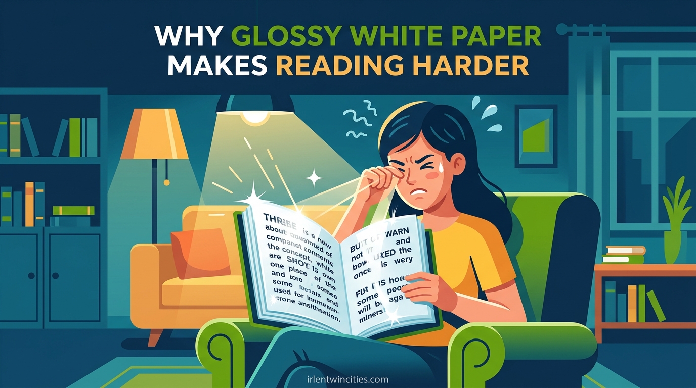
Have you ever opened a textbook or magazine and found yourself squinting within minutes? You are not alone. Many people discover that glossy white paper makes reading harder, turning what should be a simple activity into an exhausting struggle.
I first noticed this problem during my college years. The fluorescent lights in the library would bounce off those bright white textbook pages, creating a glare that made the text seem to shimmer. My eyes would tire quickly, and I often found myself rereading the same paragraph multiple times without absorbing any information.
This article explains why glossy white paper creates these reading difficulties. You will learn about the science behind visual stress, how it connects to conditions like Irlen Syndrome, and what practical solutions can help you read comfortably again.
Table of Contents
What Is Visual Stress and Why Glossy White Paper Triggers It
Visual stress is a perceptual processing condition where certain visual patterns cause discomfort, fatigue, and distortions. High-contrast patterns, especially black text on bright white backgrounds, trigger this response in sensitive individuals.
Glossy white paper poses a unique problem because of its reflective surface. Unlike matte paper that absorbs and diffuses light, glossy paper reflects light directly back toward your eyes. This creates glare that forces your visual system to work overtime.
The brightness of white paper also plays a significant role. Standard white paper reflects about 80% of light, creating a harsh visual environment. When you add the specular reflections from a glossy coating, the effect multiplies, creating what many describe as a “washout” effect where text seems to fade into the background.
The Science Behind Why Bright White Paper Hurts Your Eyes
Understanding why glossy white paper makes reading harder requires a look at how your brain processes visual information. The discomfort you feel has real neurological roots.
The Magnocellular Pathway and Visual Processing
Your visual system uses two main processing pathways: the magnocellular and parvocellular systems. The magnocellular pathway handles motion, depth, and rapid visual changes. When you look at bright, glossy paper, this pathway becomes overstimulated.
Research suggests that in people with visual stress, the magnocellular pathway functions differently. The high contrast between black text and white background creates a kind of visual “noise” that this pathway tries to process. This leads to the perception that text is moving, blurring, or disappearing.
Cortical Hypersensitivity in the Visual Cortex
The visual cortex, located at the back of your brain, processes the signals coming from your eyes. In individuals with visual stress, this area shows heightened sensitivity to certain patterns. The strong contrast of black-on-white triggers excessive neural firing.
Think of it like a microphone with the volume turned too high. Normal sounds become distorted and painful. Similarly, standard printed text becomes visually “loud” and overwhelming for a hypersensitive visual cortex.
Photoreceptor Adaptation Issues
Your eyes contain photoreceptors called rods and cones that detect light and color. When you stare at a bright white page, these receptors constantly try to adapt to the high luminance. This adaptation process requires energy and creates fatigue.
Glossy surfaces make this worse by creating uneven brightness across the page. Some spots reflect more light than others, forcing your photoreceptors to repeatedly adjust. This constant adaptation cycle contributes significantly to eye strain.
The Connection to Irlen Syndrome and Scotopic Sensitivity
Many people who struggle with glossy white paper unknowingly have a condition called Irlen Syndrome, also known as Scotopic Sensitivity Syndrome. This is a perceptual processing disorder that affects how the brain interprets visual information.
What is Irlen Syndrome? Irlen Syndrome is a visual processing condition where the brain has difficulty processing specific wavelengths of light. It is not a problem with the eyes themselves, but with how the brain interprets visual signals. The condition affects approximately 12-14% of the general population and up to 46% of individuals with reading difficulties.
What is Scotopic Sensitivity? Scotopic Sensitivity refers to heightened sensitivity to light, particularly in the visual conditions that activate the rod photoreceptors. People with this sensitivity experience discomfort, distortions, and reduced reading efficiency under certain lighting and background color conditions.
These conditions often go undiagnosed because standard eye exams test visual acuity, not visual processing. You can have 20/20 vision and still experience significant reading problems from visual stress.
The connection between these conditions and white paper sensitivity is well-documented. Helen Irlen, who identified this syndrome in the 1980s, noted that many affected individuals described white pages as “glaring,” “competing with the print,” or making letters “less readable.” These descriptions match exactly what forum users report today.
Signs You Are Experiencing Visual Stress From White Paper
Recognizing the symptoms of visual stress is the first step toward finding relief. Here are the key signs that glossy white paper may be causing your reading difficulties:
1. Text appears to move or shimmer on the page. Many people report that words seem to vibrate, wave, or slide around when they try to read on bright white backgrounds.
2. Letters blur, double, or fade into the background. This symptom, frequently mentioned in online forums, creates the sensation that letters are disappearing into the white space around them.
3. You experience eye strain or burning sensations. Physical discomfort in or around the eyes often begins within minutes of reading on glossy paper.
4. Headaches develop during or after reading. The extra effort required to process visual information can trigger tension headaches or migraines in sensitive individuals.
5. You need to reread lines multiple times. Poor comprehension despite adequate reading skills often indicates that visual stress is interfering with information processing.
6. Words appear crowded or cramped together. Some individuals describe text seeming to bunch up or run together, making it difficult to distinguish individual words.
7. You feel fatigued after short reading sessions. Reading that should be comfortable becomes exhausting much faster than it should.
One Reddit user described their experience perfectly: “Letters look like they start to space out and then disappear into the paper.” Another noted that “super black text on bright white paper is physically painful to read.” These real-world accounts confirm that visual stress is not imaginary, it is a genuine perceptual phenomenon.
Practical Solutions: From Colored Overlays to Paper Alternatives
The good news is that visual stress from glossy white paper has solutions. You do not have to suffer through reading difficulties when effective accommodations exist.
Colored Overlays: An Immediate Solution
Colored overlays are transparent sheets placed over text to reduce glare and contrast. Research from the NIH shows that colored overlays positively influence both reading fluency and reading speed for individuals with visual stress.
Overlays work by filtering specific wavelengths of light before they reach your eyes. This reduces the “visual noise” that triggers cortical hypersensitivity. Different colors work for different people, which is why individualized testing matters.
Common overlay colors include:
Yellow/Amber: Often preferred by individuals with strong light sensitivity. Yellow legal pads are popular for a reason, they reduce glare significantly.
Blue: Many readers find light blue or aqua overlays calming and effective for reducing visual distortions.
Green: This color helps some readers by reducing the harsh contrast of black text while maintaining readability.
Pink/Rose: These warmer tones work well for people who find cooler colors too harsh.
Choosing Better Paper Colors
When you have control over your reading materials, selecting alternative paper colors can make a dramatic difference. The best paper colors for reading comfort are:
Cream or Off-White: These reduce reflectance from 80% down to about 60-70%, significantly decreasing glare while maintaining good contrast.
Light Blue: Often rated as one of the most comfortable colors for extended reading, blue paper reduces brightness without making text hard to see.
Light Yellow: Classic yellow legal pads remain popular because the color naturally filters light and reduces eye strain.
Light Green: Similar to blue, green tones can provide a calming background that reduces visual stress.
Avoid bright white, fluorescent orange, or neon colors. These can be even more problematic than standard white paper.
Digital Reading Alternatives
Digital devices offer options that paper cannot match. E-readers with e-ink displays and adjustable backlighting let you control your reading environment completely.
Dark Mode: Many readers find that inverting colors, white text on a black background, eliminates their symptoms entirely. This removes the high-contrast problem at its source.
Custom Background Colors: Most reading apps allow you to change page colors. Experiment with sepia, gray, or custom colors to find what works for your eyes.
Blue Light Filters: These reduce the harshness of screen light and can be combined with color adjustments for maximum comfort.
Classroom and Workplace Accommodations
If you need accommodations in school or work settings, know that visual stress is recognized by many educational institutions and employers.
Request printed materials on colored paper when possible. Many schools and offices can provide handouts on cream or light blue paper at minimal extra cost.
Use task lighting strategically. Position lights to minimize reflections on glossy pages, or use matte-finish printed materials when available.
Consider tinted lenses if overlays are impractical for your daily activities. Irlen-certified diagnosticians can prescribe colored lenses that provide the same benefits as overlays while allowing normal activity.
Why Is It Hard to Read on White Paper?
Why is it hard to read on white paper?
White paper reflects approximately 80% of light, creating high brightness that triggers visual stress in sensitive individuals. The extreme contrast between black text and white background overwhelms the visual cortex, causing symptoms like eye strain, headaches, and perceptual distortions where text appears to move or blur. Glossy finishes worsen the problem by adding specular reflections that create uneven glare across the page.
What color paper is best for dyslexia?
The best paper color varies by individual, but research and user reports consistently favor cream, off-white, light blue, and light yellow. These colors reduce glare and brightness while maintaining adequate contrast for reading. Yellow legal pads and light blue paper are frequently cited as the most comfortable options. The ideal approach is to test different colors to find what reduces your specific symptoms.
Why do dyslexic people use yellow paper?
Yellow paper reduces the visual stress that exacerbates reading difficulties in many individuals with dyslexia. The color filters out problematic wavelengths of light and decreases the harsh contrast of black-on-white text. Yellow also has lower reflectance than white paper, reducing glare. Many people find that yellow backgrounds make text appear more stable and easier to track, reducing the rereading and comprehension problems associated with visual stress.
What type of dyslexia needs tinted paper?
Individuals with visual dyslexia or those who have Irlen Syndrome (Scotopic Sensitivity) alongside dyslexia benefit most from tinted paper. These conditions involve perceptual processing differences rather than purely phonological issues. Signs that tinted paper might help include experiencing text movement, glare sensitivity, rapid eye fatigue on white paper, and headaches during reading. Standard phonological dyslexia without visual stress may not require color accommodations.
Conclusion: Taking Control of Your Reading Comfort
Glossy white paper makes reading harder because of how it interacts with your visual processing system. The high reflectance, harsh contrast, and specular glare create a perfect storm of visual stress for sensitive individuals.
Understanding this connection empowers you to make changes. Whether you try colored overlays, switch to cream paper, enable dark mode on your devices, or seek professional Irlen screening, solutions exist that can transform your reading experience.
If you recognize yourself in the symptoms described here, consider this your invitation to explore these options. Reading should not be a painful chore. With the right accommodations, you can reclaim the comfort and enjoyment that reading should bring.