
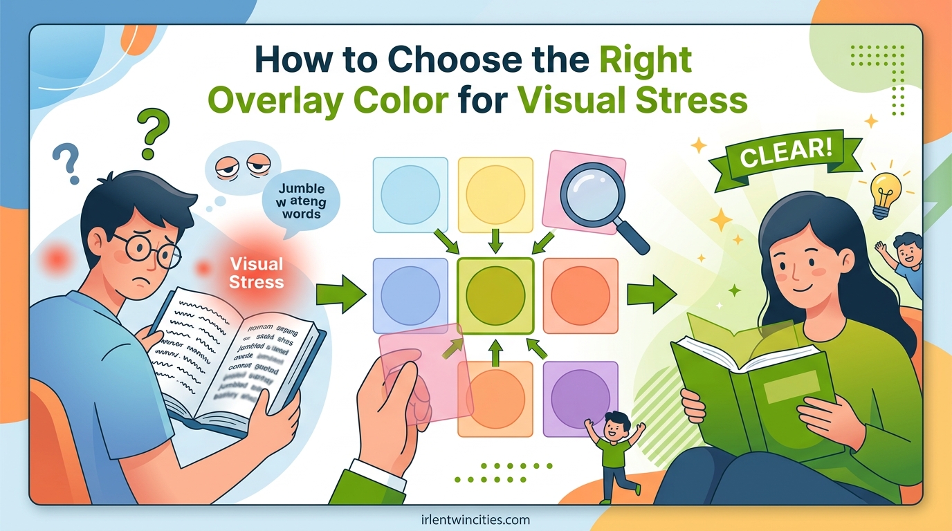
Finding the right colored overlay color for visual stress can transform reading from a frustrating chore into an enjoyable experience. I have worked with hundreds of individuals struggling with print distortion, eye strain, and headaches when reading standard black text on white paper. Through my experience, I have learned that there is no single “best” color that works for everyone.
The most effective overlay color depends entirely on your individual visual processing needs. Some people find immediate relief with a yellow overlay, while others need blue, green, or even purple tints to stabilize the words on the page. This guide will walk you through everything you need to know about choosing the right colored overlay for your specific visual stress symptoms.
We will explore the science behind how colored overlays work, examine each of the ten standard Irlen colors, and provide a practical self-testing method you can use at home. By the end of this article, you will have a clear understanding of how to identify the best colored overlay color for your visual stress.
Table of Contents
What Is Visual Stress and How It Affects Reading
Visual stress, also known as Meares-Irlen Syndrome or Scotopic Sensitivity Syndrome, is a visual processing problem that affects how the brain interprets written text. It is not a problem with your eyes themselves, but rather with how your visual cortex processes the information your eyes send to it. When someone with visual stress looks at printed text, they may experience symptoms that make reading uncomfortable or impossible.
The condition affects approximately 12-15% of the general population, with higher rates among people with dyslexia and ADHD. I have seen firsthand how undiagnosed visual stress can lead children to believe they are “slow” or “stupid” when in reality, their brains are simply processing visual information differently.
Common Symptoms of Visual Stress
Recognizing the symptoms of visual stress is the first step toward finding relief. Here are the most common signs that you or your child might be experiencing visual stress:
The text appears to move, blur, or swim on the page. Letters may seem to double, fade, or form patterns that distract from reading. Many people report that white paper appears too bright, causing glare that makes their eyes tired quickly.
Headaches and eye strain frequently occur during or after reading. Some individuals develop migraines triggered specifically by reading printed material. Others find themselves rubbing their eyes excessively or blinking more than usual while reading.
Reading comprehension often suffers because so much mental energy goes into just seeing the words clearly. People with visual stress may skip words or lines, lose their place easily, or need to use a finger to track text. They typically read slower than their intelligence would suggest and may avoid reading altogether.
The Science Behind Visual Stress
Research suggests that visual stress occurs due to cortical hyper-excitability in the visual cortex. Your visual cortex is the part of your brain that processes what you see. In people with visual stress, certain wavelengths of light trigger overactivity in specific neurons, creating the distortions and discomfort associated with the condition.
The magnocellular pathway, which handles motion and spatial processing, also appears to play a role. Some researchers believe that dysfunction in this pathway contributes to the instability of printed text that many people with visual stress report. This theory helps explain why colored overlays, which filter specific light wavelengths, can provide relief.
How Colored Overlays Work to Reduce Visual Stress
Colored overlays are transparent plastic sheets placed over written text to filter out specific wavelengths of light. They work by altering the spectral composition of light reaching your eyes before it gets processed by your visual cortex. This simple intervention can dramatically reduce or eliminate the symptoms of visual stress for many people.
I remember the first time I placed a rose-colored overlay over a page for a young student who had been struggling with reading for years. Within seconds, her face changed from concentration and discomfort to surprise and relief. The words that had been dancing on the page suddenly stabilized.
Filtering Light Wavelengths
Each colored overlay filters different portions of the light spectrum. White light contains all colors of the rainbow, but not all wavelengths affect your visual cortex equally. For people with visual stress, certain wavelengths trigger the hyper-excitability that causes symptoms.
By placing a colored overlay on the page, you are essentially removing the problematic wavelengths from the light reflecting off the white paper. The specific color that works best for you depends on which wavelengths your visual cortex finds most triggering.
Stabilizing Print and Reducing Distortion
When the right colored overlay filters out triggering wavelengths, several positive effects occur simultaneously. The background stops glaring, making the page less visually aggressive. Letters tend to stop moving or doubling, creating a stable text image.
Many people report that the spaces between words become clearer, making it easier to track from one word to the next. The contrast between text and background becomes more comfortable rather than harsh. These changes combine to make reading feel effortless rather than exhausting.
The 10 Standard Irlen Overlay Colors Explained
The Irlen Institute has standardized ten overlay colors that cover the spectrum of needs for people with visual stress. Understanding the characteristics of each color can help guide your testing process. Here is what I have learned about each color through years of working with clients.
Keep in mind that color names can vary slightly between manufacturers, and the intensity of the tint matters as much as the hue. Some people need a pale yellow, while others require a deep golden tint.
Yellow Overlays
Yellow overlays are the most commonly selected color and serve as an excellent starting point for testing. They filter blue light, which many people with visual stress find most problematic. Yellow overlays tend to help those who experience glare and brightness sensitivity.
In my testing sessions, roughly 30-40% of clients find yellow to be their optimal color. It is particularly effective for people who describe white paper as “too bright” or who struggle with fluorescent lighting. Pale yellow works for mild symptoms, while deeper golden yellow helps more severe cases.
Blue Overlays
Blue overlays, including turquoise and aqua shades, help people who are highly sensitive to warm light wavelengths. These overlays are particularly popular among individuals who experience significant light sensitivity or who read comfortably in dim lighting.
I have found blue overlays especially helpful for migraine sufferers and those with autism spectrum conditions. The cool tint creates a calming visual environment that reduces overstimulation. Blue overlays range from pale sky blue to deep turquoise.
Green Overlays
Green overlays often help people who experience headaches and eye strain while reading. The color seems to have a soothing effect on the visual system. Many clients who struggle with long reading sessions find green allows them to read for extended periods.
This color is also frequently selected by people who use computers extensively. Green overlays can reduce the eye strain associated with screen glare. The shade ranges from pale mint to deep forest green.
Rose and Pink Overlays
Rose and pink overlays are excellent for people who need high contrast needs or who experience severe print distortion. These warm tints seem to provide strong stabilization of text movement. In my experience, rose overlays are often the second color to try if yellow does not provide relief.
People with significant visual stress or those recovering from brain injuries frequently benefit from rose overlays. The color creates a comforting background that makes text feel less aggressive. Pale pink works for moderate symptoms, while deeper rose handles severe cases.
Purple Overlays
Purple overlays, ranging from lavender to deep violet, help individuals with severe visual stress who have not found relief with other colors. These overlays filter out both blue and red wavelengths, creating a unique filtering effect.
While not as commonly selected as yellow or rose, purple can be life-changing for the right person. I have worked with several clients who tried multiple colors before finding that purple finally stabilized their vision.
Orange, Gray, Magenta, and Golden Overlays
Orange overlays combine the benefits of yellow and red filtering, helping some individuals with unique wavelength sensitivities. Gray overlays reduce overall brightness without strongly tinting the page, useful for those primarily bothered by glare.
Magenta overlays filter green wavelengths and help a small percentage of people with specific visual processing differences. Golden overlays provide a deeper yellow tint for those who need stronger blue light filtering than pale yellow provides.
How to Choose the Right Colored Overlay Color for Visual Stress
Now that you understand the available colors, let me walk you through the process of finding your optimal colored overlay color for visual stress. There are two approaches: professional screening and self-testing at home.
Professional screening through a certified Irlen diagnostician provides the most accurate results. These specialists use a comprehensive testing kit with multiple colors and intensities. They can also determine if you would benefit from precision-tinted Irlen spectral filters (tinted lenses) rather than overlays.
However, self-testing with a basic set of overlays can provide significant relief for many people. Here is the method I recommend for at-home testing.
Step-by-Step Self-Testing Method
Step 1: Gather your materials. You will need a set of colored overlays in the ten standard colors, a page of text with small print (textbook size), and good lighting. You can purchase overlay sets online or through educational suppliers.
Step 2: Create the right environment. Test in the lighting where you normally read. If you read under a desk lamp, test there. If you read in natural light by a window, test there. Lighting significantly affects which color works best.
Step 3: Establish your baseline. Read a paragraph without any overlay. Note how you feel. Do words move? Is the page too bright? Are you squinting? Rate your comfort on a scale of 1-10.
Step 4: Test each color systematically. Place one overlay over the text and read the same paragraph. Look for immediate changes. Do the letters stop moving? Does the glare disappear? Can you track lines more easily?
Step 5: Rate each color. After testing each color for about 30 seconds, rate your comfort level. Do not overthink it. The right color often provides immediate, noticeable relief.
Step 6: Narrow down your top choices. Select your two or three best colors and test them again. Try reading for several minutes with each to see if the benefits hold over time.
Step 7: Test different shades. If you liked yellow, try both pale and golden. If blue helped, test turquoise and sky blue. The intensity matters as much as the hue.
What to Look for When Testing
Positive signs that an overlay color is working include immediate reports that text looks clearer or more stable. The background should feel less glaring or aggressive. Reading should feel easier, not requiring as much concentration to track words.
Watch for physical signs of relief as well. Many people unconsciously relax their shoulders or stop squinting when the right color is placed over the text. Children often show visible surprise or relief.
Negative signs include colors that make text harder to read or cause new discomfort. Some people find certain colors make them feel nauseous or cause different visual distortions. If a color does not help within 30 seconds, it is probably not the right one.
Common Mistakes to Avoid
Do not test for too long with each color. If a color is going to help, you will notice improvement within the first minute. Spending five minutes with each color leads to decision fatigue.
Do not test in the wrong lighting. A color that works perfectly under your desk lamp may not help under fluorescent classroom lights. Test in the environments where you actually read.
Do not let others choose for you. I have had parents insist their child needs yellow because “that is the dyslexia color” while the child clearly responded better to blue. Trust your own visual response.
Do not expect perfection. Overlays help many people significantly, but they do not cure underlying reading difficulties. They remove a barrier to reading, but reading instruction may still be needed.
Who Benefits from Colored Overlays
While colored overlays were originally developed for people with Irlen Syndrome, research and clinical experience have shown they help a much broader range of individuals. Understanding who benefits can help you determine if overlays might be worth trying.
Irlen Syndrome and Scotopic Sensitivity
People with Irlen Syndrome, also called Scotopic Sensitivity Syndrome, are the classic candidates for colored overlays. These individuals have the full cluster of visual stress symptoms including print movement, glare sensitivity, and headaches. For them, the right colored overlay color can be transformative.
I have worked with adults who spent their entire lives believing they were poor readers, only to discover that a simple colored overlay allowed them to read comfortably for the first time. The emotional impact of this discovery should not be underestimated.
Dyslexia and Reading Difficulties
While dyslexia is primarily a phonological processing difficulty, research suggests that up to 40% of people with dyslexia also have visual stress. For these individuals, colored overlays address one barrier to reading while other interventions address the phonological aspects.
Even people with pure dyslexia sometimes find overlays helpful because they reduce the visual effort required to read. When text is stable and comfortable, more mental energy is available for decoding and comprehension.
ADHD and Focus Improvement
Many individuals with ADHD report that colored overlays help them focus while reading. The theory is that visual instability creates additional distraction for brains already prone to wandering attention.
By stabilizing the text and reducing the visual “noise” on the page, overlays remove one source of distraction. Some parents and teachers report that children with ADHD can read for longer periods when using an appropriate overlay.
Autism and Light Sensitivity
People on the autism spectrum frequently experience sensory sensitivities, including visual sensitivities. Colored overlays can reduce the overwhelming nature of printed text for some autistic individuals.
Blue and green overlays seem particularly helpful for this population, possibly due to their calming effect on the visual system. However, as always, individual testing is necessary to find the best color.
Migraine Sufferers
Reading can trigger migraines in susceptible individuals, and visual stress is often a contributing factor. Colored overlays, particularly blue and green tints, can reduce the visual triggers that lead to headaches.
Some migraine sufferers find that overlays allow them to continue working or studying during periods when they would otherwise need to avoid reading entirely.
Brain Injury Recovery
After concussions or other brain injuries, many people develop visual stress symptoms they did not have before. The visual system becomes more sensitive, and reading becomes difficult.
Colored overlays are often part of the rehabilitation process for these individuals. Rose and purple overlays are frequently helpful during recovery.
Colored Overlays vs Tinted Glasses: Which Is Better
Once you find a colored overlay color that works for you, a natural question arises: should you stick with overlays or consider tinted glasses? Both options have their place, and the right choice depends on your specific situation.
When to Use Colored Overlays
Colored overlays are ideal for reading physical books, worksheets, and printed documents. They are inexpensive, portable, and require no prescription. For students who primarily need help with textbooks and handouts, overlays are often the perfect solution.
Overlays also allow you to test different colors easily and change colors if your needs evolve. They work immediately with no waiting period for glasses to be made.
When to Consider Irlen Spectral Filters
Irlen spectral filters are precision-tinted lenses that are worn like glasses. They are customized to your exact color needs and worn for all visual activities, not just reading. If you find yourself constantly reaching for your overlay throughout the day, glasses may be worth considering.
Spectral filters help with more than just reading. They can reduce visual stress from computer screens, classroom whiteboards, fluorescent lighting, and outdoor glare. People who experience symptoms constantly, not just while reading, often benefit more from lenses than overlays.
Pros and Cons Comparison
Overlays are less expensive initially, work immediately, and can be shared among family members testing different colors. However, they only help with reading material placed under them and cannot help with screens, whiteboards, or environmental visual stress.
Spectral filters provide all-day relief for all visual activities but require professional fitting, cost significantly more, and take time to manufacture. The color cannot be changed once the lenses are made.
Digital Overlays and Apps for Screen Reading
In 2026, digital reading has become as important as reading physical books. Fortunately, there are now options for applying colored overlays to screens. These tools are especially valuable for students who read textbooks on tablets and professionals who work extensively on computers.
Browser Extensions and Apps
Several browser extensions allow you to tint entire web pages. Helperbird, for example, offers 24 color options for overlaying websites. These tools work on Chrome, Edge, and other major browsers.
For tablets and phones, various apps provide colored overlay functionality. Some e-reader apps include built-in color adjustment features. Amazon Kindle, for instance, allows you to invert colors or use sepia modes that function similarly to overlays.
How Digital Colors Compare to Physical Overlays
Digital overlays work on the same principle as physical overlays, filtering the light emitted by your screen. However, the exact colors may not perfectly match physical overlay colors due to differences in how screens emit light versus how paper reflects it.
If you know your optimal physical overlay color, you may need to experiment to find the closest digital equivalent. Start with the same color family and adjust intensity until you achieve similar relief.
Recommended Tools for 2026
Beyond browser extensions, computer operating systems now include built-in color filtering options. Windows, macOS, iOS, and Android all offer color filter settings in their accessibility menus. These system-level filters apply across all applications.
For dedicated e-reading, consider devices with built-in warm lighting like the Kindle Paperwhite or Kobo e-readers. While not true colored overlays, the adjustable warmth can provide similar relief for some users.
Research Evidence: Do Colored Overlays Really Work
The effectiveness of colored overlays has been studied extensively, though results vary depending on the population tested and the methodology used. Understanding the research can help set realistic expectations.
Summary of Key Studies
A comprehensive review published in the journal Brain Sciences examined multiple studies on colored overlays and reading skills. The researchers found that colored overlays positively influence reading fluency and speed for some individuals, particularly those with visual stress.
Studies using the Wilkins Rate of Reading Test consistently show that the right colored overlay can improve reading speed by 10-25% for people with visual stress. Some individuals show even more dramatic improvements.
Reading Speed Improvements Documented
Research at the University of Essex found that children who selected colored overlays as beneficial showed significant improvements in reading rate when using their chosen color. Importantly, children who did not show a clear color preference did not benefit, suggesting that individual color selection is crucial.
These findings support what I have observed clinically: overlays help the people who actually need them, but they are not a universal solution for all reading difficulties.
Addressing Skepticism and Limitations
Some researchers have questioned whether colored overlays provide genuine benefit or simply placebo effects. Well-designed studies control for this by measuring reading speed objectively rather than relying solely on self-reported comfort.
The current scientific consensus is that colored overlays provide genuine benefit for a subset of the population with visual stress, but they do not help everyone. They are not a cure for dyslexia or other learning disabilities, but rather a tool that removes one specific barrier to reading.
More research is needed to fully understand the mechanisms behind why specific colors work for specific individuals. The relationship between overlay color and the underlying visual processing differences remains an active area of investigation.
What to Do If Colored Overlays Do Not Help
Not everyone finds relief with colored overlays, and that is important to acknowledge. If you have tested multiple colors systematically and found no benefit, consider these next steps.
First, verify that you tested in appropriate lighting and with the right materials. Sometimes a color that did not help in fluorescent light provides relief in natural light. Testing conditions matter significantly.
Second, consider whether your reading difficulties stem primarily from phonological issues rather than visual stress. Overlays address visual processing problems, not decoding or comprehension difficulties. You may need reading instruction, tutoring, or evaluation for dyslexia.
Third, consult with an eye care professional to rule out uncorrected vision problems. While visual stress is a brain processing issue, co-existing vision problems like astigmatism or convergence insufficiency can mimic or compound visual stress symptoms.
Finally, consider a professional Irlen screening. Certified Irlen diagnosticians have access to a wider range of colors and intensities than basic overlay sets provide. They can also determine if precision-tinted spectral filters would be more appropriate than overlays.
Frequently Asked Questions About Colored Overlays for Visual Stress
How do I know what color overlay to use?
Test each color systematically by placing it over text and reading for 30 seconds. The right color will provide immediate relief from symptoms like moving text, glare, or eye strain. Rate your comfort with each color and choose the one that makes reading feel easiest.
What are the colors for Irlen Syndrome overlays?
The Irlen Institute offers ten standard overlay colors: yellow, golden, rose, pink, turquoise, blue, green, orange, gray, and purple. Each color filters different light wavelengths. Yellow is the most commonly selected color, but the best choice varies by individual.
Do coloured overlays help with ADHD?
Many people with ADHD find colored overlays helpful for reading focus. Visual stress can create additional distraction for attention-challenged brains. By stabilizing text and reducing visual noise, overlays remove one barrier to concentration. However, overlays address visual symptoms, not the core attention difficulties of ADHD.
What color overlay works best for dyslexia?
There is no single best color for dyslexia because visual needs vary by individual. While yellow is commonly associated with dyslexia support, some people benefit more from blue, green, or rose overlays. Testing multiple colors is essential to find what works for your specific visual processing needs.
Are visual stress and dyslexia linked?
Visual stress and dyslexia are separate conditions that often co-occur. Dyslexia is primarily a phonological processing difficulty, while visual stress is a visual cortex processing issue. Research suggests 40% of people with dyslexia also have visual stress. Colored overlays help with the visual stress component but do not address phonological aspects of dyslexia.
Which colour is best for dyslexia and visual stress?
The best color is highly individual. Yellow overlays help approximately 30-40% of people with visual stress. Blue and green overlays are also frequently selected. The only way to determine your optimal color is through systematic self-testing or professional Irlen screening with multiple color options.
Conclusion
Finding the best colored overlay color for visual stress is a personal journey that requires testing and patience. While yellow overlays help the largest percentage of people, your optimal color might be blue, green, rose, or any of the other eight standard Irlen colors.
The key is to approach color selection systematically, testing each option in your normal reading environment. Pay attention to immediate improvements in text stability, glare reduction, and reading comfort. Trust your visual response rather than what works for others.
If overlays provide relief, you have gained a simple, inexpensive tool that can transform your reading experience. If they do not help after thorough testing, consult with professionals to explore other causes of your reading difficulties. Whether you stick with overlays or eventually move to tinted lenses, understanding your visual processing needs is the first step toward comfortable, enjoyable reading.