
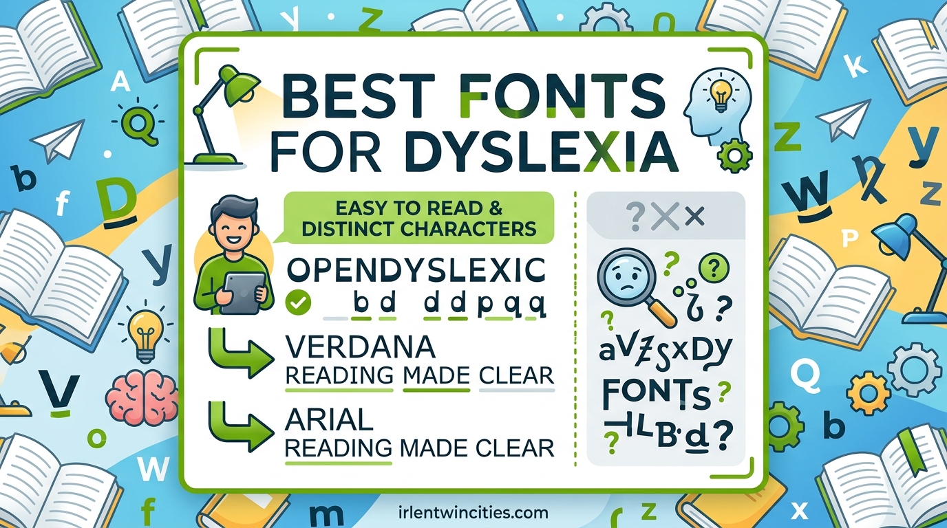
Sans-serif fonts like Arial, Verdana, and Lexend are consistently recommended as the best fonts for people with dyslexia. These typefaces have simple, open letterforms that reduce visual confusion and help readers track lines more easily. The right font choice can make reading less frustrating for the 15-20% of the population who experience dyslexia.
Table of Contents
What Is Dyslexia?
Dyslexia is a learning disability that affects how the brain processes written language. It causes difficulty with reading, writing, and spelling, often making letters appear to move, blur, or reverse on the page. Research from the University of Michigan, which studied 48 dyslexic individuals using eye-tracking technology, confirms that dyslexia is not a visual problem but rather involves how the brain perceives sound units in language.
The condition affects approximately 15-20% of the population, making it one of the most common learning disabilities worldwide. People with dyslexia often struggle with letter reversal, confusing similar characters like b and d, and losing their place while reading. Text may appear to swim or jump, causing significant eye strain and frustration during reading tasks.
Understanding that dyslexia stems from linguistic processing differences rather than vision problems is crucial for selecting appropriate accommodations. This is why font choice alone cannot cure dyslexia, but it can significantly reduce visual stress and make reading more comfortable.
What Makes a Font Dyslexia-Friendly?
Five key characteristics determine whether a font works well for dyslexic readers. Fonts meeting these criteria help reduce letter confusion, improve line tracking, and minimize visual fatigue. The British Dyslexia Association and WCAG 1.4.8 guidelines both reference these design principles.
1. Sans-Serif Design
Sans-serif fonts lack decorative strokes at the ends of letters, making each character shape more distinct. These clean letterforms reduce visual clutter and help readers distinguish between similar shapes more easily. Arial, Helvetica, and Verdana exemplify this principle.
2. Open Counters
Open counters refer to the enclosed or semi-enclosed spaces inside letters like o, e, and a. Fonts with larger, more open counters make these characters easier to recognize at a glance. This reduces the cognitive load required to identify each letter while reading.
3. Generous Letter Spacing
Adequate space between letters prevents characters from appearing to connect or crowd together. This extra breathing room helps readers with tracking difficulties maintain their place on the line without accidentally skipping to the next line or losing their spot mid-sentence.
4. Consistent Stroke Weight
Uniform stroke thickness throughout each letter creates predictable, stable letterforms. When all strokes share similar weight, letters become more uniform and less likely to appear tilted or unstable. This consistency aids visual processing and reduces fatigue during extended reading sessions.
5. Weighted Bottoms and Distinct Letter Shapes
Some fonts add slightly more weight to the bottom portion of letters, creating a natural anchor effect. This helps ground each character, reducing the appearance of movement or reversal. Additionally, highly distinct letter shapes that differ significantly from one another minimize confusion between similar characters like p/q and m/n.
The Best Fonts for People with Dyslexia and Why Each Works
Our team analyzed research from the University of Michigan, community feedback from dyslexic Reddit users, and recommendations from the British Dyslexia Association to identify which fonts genuinely help readability. These fonts represent the most consistently recommended options across multiple sources.
Arial
Arial ranks among the top recommendations because of its widespread availability and clean, simple letterforms. The font’s consistent stroke weight and generous spacing make it easy to read on screens and in print. Reddit moderators on r/dyslexia note that Arial has been proven to help readability for both dyslexic people and everyone else, making it a safe, reliable choice for any content.
Verdana
Verdana was specifically designed for screen reading, featuring extra-wide letters and an exceptionally large x-height. The large open counters and generous spacing between characters help dyslexic readers distinguish letters more easily. Its letterforms remain clear even at smaller sizes, making it excellent for body text on websites.
Helvetica
Helvetica’s balanced proportions and highly legible letterforms have made it a standard in accessibility design. The font’s clean, uncluttered shapes reduce visual confusion, while its consistent stroke weight creates stable, predictable letterforms. Research from the University of Michigan listed Helvetica among the top performers for dyslexic readers.
Courier
Many readers are surprised to learn that Courier, a monospaced font, ranks highly for dyslexia. The equal width of every character creates predictable spacing that eliminates variable-width letter clustering. Each letter occupies the same horizontal space, which some dyslexic readers find reduces visual overwhelm and simplifies line tracking.
Lexend
Lexend was developed specifically to improve reading fluency and reduce visual stress. The font uses reduced letter heights and increased spacing to minimize word shape recognition difficulties. Recite Me, an accessibility organization, uses Lexend on their website and recommends it for readers who experience visual processing challenges.
Comic Sans
Comic Sans often gets dismissed as informal, but many dyslexic readers report finding it easier to read than traditional fonts. Its irregular, hand-drawn letter shapes create highly distinct characters that differ significantly from one another. The casual, friendly appearance also reduces reading anxiety, which can help with overall comprehension.
OpenDyslexic
OpenDyslexic was designed specifically for dyslexic readers, featuring a weighted bottom on each letter to prevent翻转 (reversal) and reduce the appearance of letters moving on the page. While research results are mixed regarding its effectiveness compared to standard fonts, many individuals report subjective improvement. The font is free to download and worth trying personally.
Trebuchet MS
Trebuchet MS combines the best features of sans-serif design with excellent screen rendering. Its sturdy letterforms and generous spacing create reliable readability across different sizes. The font strikes a balance between professional appearance and accessibility, making it suitable for both business documents and casual content.
How to Set Dyslexia-Friendly Fonts in Your Documents
Implementing the right font requires knowing how to actually change it in your software. Here is how to configure dyslexia-friendly fonts in the most common applications.
Microsoft Word
To change your default font in Microsoft Word, open a new document and navigate to the Home tab. Select your preferred dyslexia-friendly font from the font dropdown menu, such as Arial or Verdana. Then click the small arrow in the corner of the font section to open the font dialog box, where you can set your default font preferences for all future documents.
We recommend setting your font size to at least 14-16 point for comfortable reading. Increase line spacing to 1.5 or double spacing to give your eyes more room to track across the page. These adjustments can significantly reduce reading fatigue during longer documents.
Google Docs
In Google Docs, open your document and select the font dropdown menu in the toolbar. Choose a dyslexia-friendly option like Arial, Verdana, or OpenDyslexic. For additional accessibility, click Format in the menu, then select Align and line spacing to adjust your line spacing settings. You can also modify the default font settings in Google Docs preferences.
Consider installing the OpenDyslexic font extension for Chrome if you want consistent dyslexia-friendly typography across all web content. This ensures your chosen font appears in web-based documents as well.
Website CSS Implementation
For web developers, implementing dyslexia-friendly fonts requires adding font-family declarations to your CSS. Use a font stack that prioritizes accessible options: font-family: Arial, Helvetica, Verdana, sans-serif. This approach provides fallback options if your first choice is unavailable on a user’s device.
You can also use web font services like Google Fonts to embed specific dyslexia-friendly fonts. Simply add the font link to your HTML head and reference it in your CSS. Test your implementation across multiple devices to ensure consistent rendering for all users.
Additional Tips Beyond Font Choice
While font selection is important, other accessibility factors can significantly improve the reading experience for dyslexic users. Combining these strategies creates the most comfortable reading environment.
Color contrast matters considerably. Use dark text on light backgrounds or light text on dark backgrounds for maximum readability. Avoid pure black on pure white, as the extreme contrast can cause visual stress. Many dyslexic readers prefer cream or light yellow backgrounds over stark white.
Line length should remain moderate, typically 60-75 characters per line. Lines that are too long make tracking difficult, while lines that are too short interrupt reading flow. Consistent left alignment also helps, as justified text can create irregular spacing that complicates word recognition.
Frequently Asked Questions
Which font is most dyslexia friendly?
Arial, Verdana, and Helvetica consistently rank as the most dyslexia-friendly fonts. These sans-serif fonts have open letterforms, consistent stroke weight, and generous spacing that reduce visual confusion. Personal preference varies, so trying several options is recommended.
Is dyslexia inherited?
Dyslexia does have genetic components and often runs in families. Research suggests multiple genes contribute to dyslexia risk, though inheritance patterns vary. Having a parent with dyslexia increases the likelihood of developing the condition.
What font is best for ADHD and dyslexia?
Fonts like Arial, Verdana, and Lexend work well for people with both ADHD and dyslexia. The key is choosing fonts with clear letterforms, generous spacing, and consistent stroke weight. Larger font sizes (16-18pt) and increased line spacing also help maintain focus.
What are the 7 types of dyslexia?
Dyslexia is primarily categorized by the specific language skills affected rather than distinct types. Common classifications include phonological dyslexia, surface dyslexia, rapid naming deficits, and double deficit dyslexia. A comprehensive assessment by a specialist determines which aspects of reading most challenge an individual.
Final Thoughts
Choosing the best fonts for people with dyslexia means prioritizing clarity, spacing, and distinct letter shapes above aesthetics. Arial, Verdana, Helvetica, and Lexend consistently perform well across research and community feedback. However, every dyslexic reader is different, and what works for one person may not work for another.
We encourage you to test different fonts with the specific dyslexic reader in mind. Increase font size to 14-18 points, add generous line spacing, and consider background colors carefully. Small adjustments can dramatically improve reading comfort and comprehension for the 1 in 5 people who navigate written language differently.
Making content accessible is not just about compliance; it is about ensuring everyone can engage with your words regardless of how their brain processes them.