
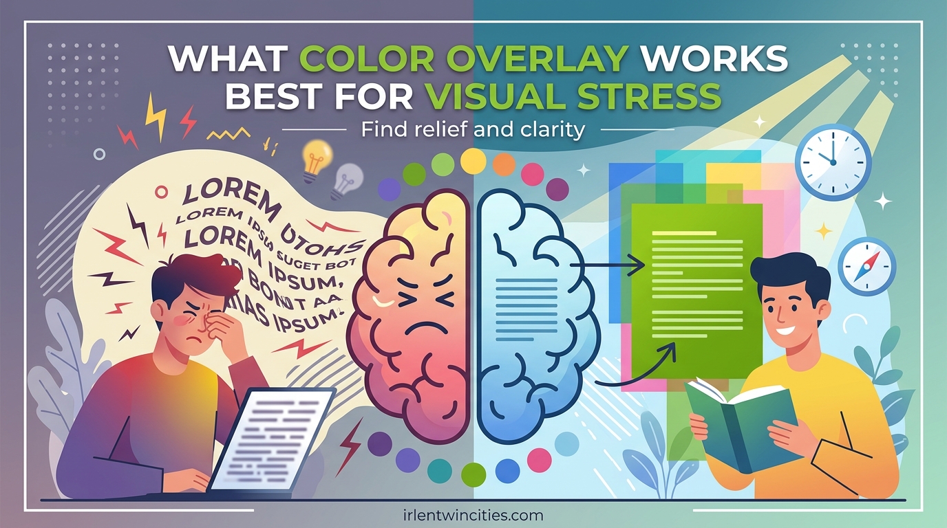
Finding the right color overlay for visual stress can transform reading from a frustrating struggle into an enjoyable experience. I have worked with hundreds of individuals experiencing print distortion, eye strain, and reading fatigue over the past decade. The answer to which color works best is both simple and complex: there is no single universal color that helps everyone, but there is almost certainly a specific color that will help you.
Visual stress affects approximately 12-20% of the population, including many people who have no other learning difficulties. In this guide, I will explain exactly how colored overlays work, walk you through finding your optimal color, and share practical testing methods you can try at home today.
By the end, you will understand not just which colors are commonly most effective, but how to determine the specific shade that matches your unique visual processing needs.
Table of Contents
What Is Visual Stress and Irlen Syndrome
Visual stress, also known as Scotopic Sensitivity Syndrome or Irlen Syndrome, is a perceptual processing disorder affecting how the brain interprets visual information. Your visual cortex becomes hypersensitive to certain wavelengths of light, particularly the high-contrast combination of black text on white paper or screens.
This condition was first identified by Helen Irlen in the 1980s, though similar observations were made earlier by Olive Meares, leading to the dual naming of Meares-Irlen Syndrome. The condition is not a problem with your eyes themselves. Your eyes may be perfectly healthy. Instead, it is a neurological issue in how your brain processes the visual signals it receives.
When light enters your eyes, it travels to the visual cortex at the back of your brain. For most people, this processing happens smoothly. For those with visual stress, specific light wavelengths cause the visual cortex to become over-excited. This over-stimulation creates the symptoms that make reading difficult and uncomfortable.
Common Symptoms of Visual Stress
You may experience visual stress if you notice text appearing to move, shimmer, or flicker on the page. Many people report that letters seem to swap positions, fade in and out, or create rivers of white space running through paragraphs. Some see halos around words or experience the sensation that words are sliding off the page.
Physical symptoms often accompany these visual distortions. Headaches during or after reading are common. Eye strain, watering eyes, and the need to rub your eyes frequently may occur. Many people with undiagnosed visual stress develop strategies like using their finger to track lines, frequently losing their place, or simply avoiding reading altogether.
Reading fatigue sets in unusually quickly. Where others might read for hours, you may find yourself exhausted after 15-20 minutes. This leads to poor comprehension, as you are working so hard just to see the text that you cannot focus on understanding it.
How Colored Overlays Work
Colored overlays work by filtering out specific wavelengths of light before they reach your visual cortex. The transparent colored sheet placed over text changes the spectral composition of the light reflected from the page. This reduces the stimulation that causes your visual cortex to become over-excited.
The science behind this involves your magnocellular pathway, one of the two main processing routes in your visual system. This pathway handles motion detection, depth perception, and the timing of visual signals. In visual stress, this pathway can become hyperactive when exposed to high-contrast patterns like stripes of text.
Research suggests that the timing of visual signals arriving at your brain becomes disrupted. The magnocellular pathway should coordinate with the parvocellular pathway (which handles color and fine detail), but in visual stress, this timing is off. Colored overlays appear to normalize this timing, allowing the two pathways to work together properly again.
By reducing contrast and filtering problematic wavelengths, overlays decrease cortical over-excitability. Your brain no longer has to work overtime to process the visual information. The result is clearer, more stable text that stays where it should on the page.
Signs You May Benefit from a Colored Overlay
Determining whether colored overlays might help you starts with recognizing the signs of visual stress. Not everyone who struggles with reading has this condition, but many who do have never considered it as a possible cause of their difficulties.
Watch for these key indicators when you read:
- Text appears to move, swim, or flicker on the page
- Letters seem to change size, fade, or blur
- Words look like they are sliding off the page or falling into each other
- You see patterns in the white spaces between lines and words
- Headaches develop during or after reading
- Your eyes feel tired, water, or burn when reading
- You frequently lose your place or need to re-read sentences
- Bright white paper feels uncomfortable or glaring
- You prefer dim lighting when reading
- Reading comprehension drops sharply after short periods
If you experience three or more of these symptoms, testing colored overlays is worth your time. Many adults have lived with these symptoms for years, assuming everyone sees text this way. Discovering that a simple colored sheet can change their reading experience often comes as a revelation.
Children may not articulate these symptoms clearly. They might say the words are “jumpy,” report that their eyes hurt, or simply avoid reading activities. Teachers and parents often notice these children tracking text with their finger, skipping lines, or rubbing their eyes frequently.
What Color Overlay Works Best for Visual Stress
The question of which color works best has a nuanced answer. Research and clinical practice show that different colors work for different people. However, certain patterns have emerged that can guide your initial testing.
Blue overlays are often effective for individuals experiencing significant pattern glare or light sensitivity. The blue filter reduces high-energy wavelengths that tend to over-stimulate the visual cortex. Many people report an immediate sense of calm and clarity when the right blue shade is placed over text.
Yellow overlays serve as an excellent starting point for many readers. They provide moderate contrast reduction while filtering wavelengths that commonly cause problems. Yellow tends to help those whose primary symptom is text instability rather than severe light sensitivity.
Pink and magenta overlays work well for individuals whose visual stress manifests as rivers of white space running through text. These colors effectively reduce the pattern glare that creates distracting visual patterns between lines of text.
Green overlays offer balanced filtering for those who need moderate help across multiple symptoms. Green sits in the middle of the visible spectrum and can provide relief when neither warm nor cool colors seem quite right.
Orange and peach overlays help readers who find cool colors uncomfortable. These warmer filters can reduce glare while maintaining a comfortable reading experience for those sensitive to the sterility of white pages.
No Universal Best Color
The most important fact to understand is that visual stress is highly individual. Your optimal color depends on your specific neurological response to light wavelengths. What works perfectly for one person may have no effect or even make symptoms worse for another.
This individuality explains why some studies have shown conflicting results about overlay effectiveness. When researchers test a single color on a broad population, results are mixed. When individuals find their specific optimal color, improvements are often dramatic and consistent.
My clinical experience suggests that finding your color is more important than which color you start with. Someone who finds the right pale blue overlay may see a 30% improvement in reading speed. That same person might see no benefit from yellow and feel worse with orange. The color matters, but the specific shade matters more.
The Color Selection Process
Finding your optimal overlay color involves systematic testing. You can begin this process at home with an overlay set, then decide whether professional assessment would provide additional benefit.
Step 1: Gather Testing Materials
Acquire a set of colored overlays that includes at least the standard range: yellow, blue, green, pink, orange, and clear. Some sets include 10 or more variations with different saturation levels. You will also need a page of text printed in a standard font like Arial or Times New Roman at 12-point size on white paper.
Step 2: Create Proper Testing Conditions
Test under the lighting conditions where you normally read. If you primarily read at school or work under fluorescent lights, test there. If you read at home under warm LED bulbs, test in that environment. Light quality significantly affects which color works best.
Step 3: Establish a Baseline
Read the test page without any overlay first. Pay attention to how the text looks and how your eyes feel. Note any movement, blurring, or discomfort. Read for 2-3 minutes to allow symptoms to develop.
Step 4: Test Each Color Systematically
Place each overlay over the text and read for 2-3 minutes with each one. Do not rush this process. Look for changes in text stability, clarity, and comfort. Rate each color on a scale of 1-10 based on how much it improves your reading experience.
Step 5: Narrow Down Your Options
Identify the 2-3 colors that felt best during initial testing. Test these again, paying closer attention to subtle differences. Try reading longer passages to see if benefits hold over time. Sometimes a color feels good initially but becomes less effective during extended reading.
Step 6: Fine-Tune the Shade
If you have multiple shades of your preferred color family, test these variations. A light blue may work better than dark blue. A pale pink might outperform a saturated magenta. These fine distinctions can make a significant difference in your results.
Understanding Different Overlay Colors
Each overlay color filters different portions of the light spectrum. Understanding what each color typically addresses can help guide your testing and expectations.
| Color | Best For | Filters |
|---|---|---|
| Yellow | General reading stability, text movement | Blue-violet wavelengths |
| Blue | Pattern glare, light sensitivity, migraines | Yellow-orange wavelengths |
| Pink/Magenta | White space patterns, rivers between lines | Green wavelengths |
| Green | Moderate contrast reduction | Magenta-red wavelengths |
| Orange/Peach | Warmth preference, high contrast reduction | Blue-cyan wavelengths |
| Purple | Severe pattern glare, specific light sensitivities | Yellow-green wavelengths |
Yellow overlays are often recommended as a starting point because they address common symptoms without being too specialized. They filter blue light, which tends to scatter more in the eye and can contribute to visual discomfort. Many people report that yellow makes text feel more “solid” and stable.
Blue overlays work differently by reducing the overall brightness and filtering out the yellow-orange portion of the spectrum. People with light sensitivity and those who experience migraines often gravitate toward blue. The cooling effect can feel immediately soothing to an over-stimulated visual system.
Pink and magenta overlays excel at reducing the patterns that appear in white space. If you see distracting shapes, lines, or colors in the gaps between text, these overlays often eliminate that phenomenon. The green-filtering properties of magenta address specific neurological responses to those wavelengths.
Who Can Benefit from Colored Overlays
While visual stress can affect anyone, certain populations show higher rates of the condition and may experience particularly significant benefits from colored overlays.
Dyslexia and Reading Difficulties
Research suggests that 30-40% of individuals with dyslexia also experience visual stress. For these individuals, colored overlays can provide substantial reading improvement even when phonological training alone has not been successful. It is important to note that visual stress is not the same as dyslexia, but the two conditions frequently co-occur.
When visual stress is present alongside dyslexia, addressing it can make other interventions more effective. A child who can finally see text clearly is better able to focus on decoding and comprehension strategies. Adults who have struggled with reading their entire lives may discover that a significant portion of their difficulty was visual rather than cognitive.
ADHD and Attention Improvements
People with ADHD often report that reading feels exhausting and requires intense focus that quickly depletes. This may be partially due to visual stress making the reading process harder than it needs to be. Colored overlays can reduce the cognitive load required to process text, freeing up mental resources for comprehension and retention.
Several studies have noted improvements in sustained attention during reading tasks when colored overlays are used. The reduction in visual distraction allows readers to maintain focus longer without the fatigue that typically breaks concentration.
Autism and Sensory Processing
Sensory sensitivities are common in autism, and visual processing differences are well-documented. Many autistic individuals experience visual stress symptoms and find relief through colored overlays or tinted lenses. The reduction in visual overwhelm can have cascading benefits for overall regulation and comfort.
For some autistic readers, colored overlays reduce not just reading difficulties but also anxiety associated with visual environments. Schools and workplaces that accommodate colored overlay use often report improved participation and reduced distress.
General Population
You do not need any diagnosed condition to benefit from colored overlays. Many people without dyslexia, ADHD, or autism experience visual stress and simply assume everyone sees text the way they do. These individuals often discover overlays accidentally and are amazed by the difference.
Students experiencing reading fatigue, professionals who spend long hours on screens, and older adults developing reading difficulties may all find that colored overlays provide meaningful relief. If you experience any symptoms of visual stress, overlays are worth trying regardless of your diagnostic history.
Colored Overlays vs Tinted Lenses
Once you identify that colored filters help your visual stress, you face a decision between continuing with overlays or investing in precision-tinted lenses. Both options have advantages depending on your needs and circumstances.
Colored Overlays
Overlays are inexpensive, portable, and require no prescription. You can test multiple colors easily and switch between them for different tasks. They work well for reading physical books and documents, and some people use them with tablets by placing the overlay over the screen.
The limitations of overlays include the inconvenience of holding or positioning them, limited effectiveness for distance viewing, and reduced utility for activities beyond reading. They cannot help with whiteboards, signs, or environmental visual stress in the same way lenses can.
Precision-Tinted Lenses
Tinted lenses, sometimes called Irlen Spectral Filters, provide the same color benefits as overlays but in a wearable format. They help with all visual tasks throughout your day, not just reading. The color can be precisely calibrated to your needs through professional assessment.
Lenses require professional fitting and are significantly more expensive than overlays. Not all optometrists offer this service; you typically need to visit a certified Irlen screener or similar specialist. Insurance coverage varies, and many people pay out of pocket for this service.
When to Consider Upgrading to Lenses
Consider tinted lenses when you have confirmed through overlay testing that color filtering helps you significantly. If you rely on overlays daily and find the inconvenience frustrating, lenses offer freedom. If you experience visual stress symptoms during non-reading activities, lenses provide protection throughout your day.
Many people successfully use overlays for years before transitioning to lenses. Others find that overlays meet their needs completely and never make the switch. Your choice depends on your specific symptoms, lifestyle, and budget.
Research Evidence and Effectiveness
The scientific literature on colored overlays presents a nuanced picture. Multiple studies have demonstrated significant benefits for specific individuals, while broader population studies have shown more modest average effects.
A landmark study by Arnold Wilkins at the University of Essex found that approximately 20% of schoolchildren showed measurable reading speed improvements with colored overlays. Subsequent research has generally supported that figure, with studies reporting 20-40% of tested individuals showing meaningful benefit.
For those who respond positively to colored overlays, the improvements can be substantial. Reading speed increases of 10-25% are common, with some individuals seeing even greater gains. More importantly, many report reduced fatigue, fewer headaches, and improved comprehension due to being able to focus on content rather than visual struggle.
Some researchers have questioned whether overlay benefits are purely placebo effects. Double-blind studies have largely addressed this concern, showing that specific colors chosen through systematic testing outperform random colors even when participants do not know which color they are using. The color specificity argues against a purely placebo explanation.
The variability in research results reflects the individual nature of visual stress. Studies that test one color on everyone find limited benefits. Studies that allow individuals to find their optimal color find significant benefits for that subset of responders. This pattern suggests that proper color selection is essential for results.
Professional Testing vs Self-Testing
You can test colored overlays at home, but professional assessment offers additional benefits. Understanding both options helps you decide the best approach for your situation.
Self-Testing at Home
Home testing is accessible and affordable. Purchase an overlay set online and follow the systematic testing process described earlier. Many people successfully identify helpful colors this way and experience genuine improvement without professional involvement.
The limitations of home testing include the lack of expert guidance if results are unclear, the potential to miss subtle but important distinctions between similar colors, and the absence of assessment for whether tinted lenses might serve you better. You also miss the opportunity to rule out other vision problems that might require different interventions.
Professional Assessment
Certified Irlen screeners and similar professionals conduct comprehensive visual stress assessments. They use specialized equipment to test a wider range of colors and shades than home kits provide. Their training helps them identify subtle responses you might miss on your own.
Professional assessment typically includes testing for whether you would benefit from precision-tinted lenses and can often provide those lenses directly or through partner optometrists. The assessment may also identify other visual processing issues beyond visual stress that require different treatments.
Costs for professional assessment vary but typically range from $150 to $400. Tinted lenses add significantly to this cost. Some insurance plans cover portions of this expense, particularly if the assessment is conducted by an optometrist rather than an independent screener.
Frequently Asked Questions
How to know what color overlay to use?
Test multiple colors systematically by placing each overlay over a page of text and reading for 2-3 minutes. Rate each color based on text stability, clarity, and comfort. The color that makes text appear most stable and reduces eye strain is your optimal choice. Yellow and blue are common starting points, but individual responses vary significantly.
What are yellow overlays used for?
Yellow overlays filter blue-violet light wavelengths and are commonly used to improve text stability and reduce general reading discomfort. They serve as an excellent starting point for testing because they address the most common visual stress symptoms without being too specialized. Many people find yellow makes text feel more solid and less likely to move or shimmer.
What is a coloured overlay for Irlen Syndrome?
A colored overlay for Irlen Syndrome is a transparent colored sheet placed over reading material to filter specific light wavelengths that over-stimulate the visual cortex. The overlay changes the spectral composition of light reaching the eyes, reducing the hypersensitivity that causes symptoms like print distortion, eye strain, and headaches during reading.
Do coloured overlays help with ADHD?
Colored overlays can help some individuals with ADHD by reducing the cognitive load required to process text. When visual stress is present alongside ADHD, overlays may improve sustained attention during reading tasks and reduce reading-related fatigue. However, overlays address visual processing issues specifically, not ADHD itself. Not everyone with ADHD has visual stress.
Do coloured overlays work?
Colored overlays work for approximately 20-40% of people who test them, particularly those with visual stress symptoms. For individuals who find their optimal color, reading speed improvements of 10-25% are common, along with reduced eye strain and headaches. The key is finding the specific color that matches your neurological needs, as benefits are highly individual.
Can you grow out of visual stress?
Visual stress typically does not resolve on its own with age. It is a neurological difference in how the brain processes visual information, not a developmental phase. However, individuals can learn coping strategies, and symptoms may fluctuate based on stress levels, fatigue, and environmental factors. Colored overlays and tinted lenses provide ongoing management rather than cure.
Do tinted glasses for visual stress work?
Precision-tinted glasses for visual stress work similarly to overlays but provide all-day protection for all visual activities. When properly fitted by a professional using the correct color for your specific needs, they can be highly effective. They are particularly beneficial for people who experience visual stress beyond reading or find overlays inconvenient for daily use.
Can colored overlays help adults?
Colored overlays can help adults just as effectively as children. Many adults discover overlays after decades of struggling with reading, assuming their difficulties were normal. Adults often report dramatic improvements in reading comfort, speed, and comprehension once they find their optimal color. The neurological differences causing visual stress persist throughout life.
Conclusion
The question of what color overlay works best for visual stress has a clear answer: the specific color that matches your unique visual processing needs. While yellow, blue, and pink overlays help many people, your optimal color can only be determined through systematic testing.
Visual stress affects millions of people who may never realize their reading difficulties have a visual component. The symptoms are real, the science is sound, and the intervention is simple. A colored overlay costing a few dollars can transform reading from a struggle into a pleasure.
I encourage you to test colored overlays if you experience any symptoms of visual stress. Follow the systematic process outlined in this guide, be patient in finding your optimal shade, and consider professional assessment if you need additional guidance. The right color is out there, and finding it may change how you experience text forever.