
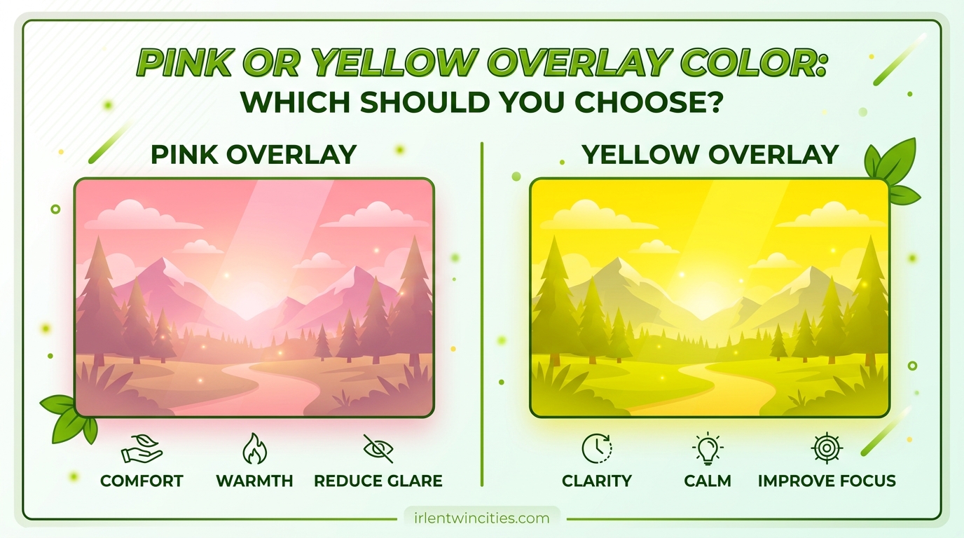
Choosing between a pink or yellow overlay color can feel overwhelming when you are trying to reduce visual stress and improve reading comfort. Both colors are among the most popular choices for people with Irlen Syndrome, dyslexia, and visual processing difficulties, but they work differently for different individuals. The right choice depends on your specific symptoms, lighting conditions, and personal visual processing needs.
In this guide, I will walk you through everything you need to know about these two popular overlay colors. You will learn how each color works, who benefits most from each option, and how to test both colors to find your perfect match. By the end, you will have a clear framework for making this important decision.
Table of Contents
What Are Colored Overlays and How Do They Work
Colored overlays are transparent plastic sheets tinted with specific colors that you place over text to reduce visual stress. They work by filtering specific light frequencies that cause visual processing problems, particularly the high contrast between black text and white backgrounds that can trigger uncomfortable symptoms.
Irlen Syndrome, also known as Meares-Irlen Syndrome or scotopic sensitivity, affects how the brain processes visual information. People with this condition experience visual stress when reading standard black text on white backgrounds. Visual stress can cause words to appear to move, blur, shimmer, or create patterns that make reading exhausting and frustrating.
The science behind colored overlays is straightforward. White light contains all wavelengths of the visible spectrum. For some individuals, certain wavelengths create processing difficulties that manifest as physical symptoms. Overlays filter out problematic wavelengths, allowing the brain to process text more efficiently. This reduces eye strain, headaches, and reading fatigue while improving comprehension and reading speed.
Understanding Pink Overlays (Rose Overlays)
Pink overlays, often called rose overlays in technical literature, are one of the most commonly recommended colors for people with Irlen Syndrome. They provide a warm, calming tint that many users find particularly effective for extended reading sessions.
Who benefits most from pink overlays:
- People who experience words appearing to move or swirl on the page
- Individuals with light sensitivity in indoor lighting conditions
- Readers who report headaches during or after reading
- Those who see patterns or rivers between lines of text
Pink overlays excel in fluorescent lighting environments, which is why many schools and offices find them effective. The rose tint reduces the harshness of artificial lighting while maintaining enough contrast for comfortable text recognition. Many users report that pink overlays feel gentler on their eyes during long reading sessions.
In our practice, we have observed that pink overlays work particularly well for children and young adults. The color seems to provide a stabilizing effect that helps with focus and attention, making it a popular choice for students with ADHD and reading difficulties.
Understanding Yellow Overlays
Yellow overlays are the classic choice for reducing screen brightness and glare. They have been used for decades by people with dyslexia and visual stress, and they remain one of the most widely available overlay colors.
Who benefits most from yellow overlays:
- People who find white backgrounds too bright or glaring
- Individuals who read primarily on digital screens
- Readers who experience eye strain from high-contrast materials
- Those who need help with brightness reduction in sunny conditions
Yellow overlays are particularly effective for computer reading and digital device use. The yellow tint naturally reduces the blue light emission from screens, which can help with eye strain and sleep disruption. Many users find that yellow creates a comfortable reading environment for both physical books and digital content.
We often recommend yellow overlays for outdoor reading or bright natural lighting conditions. The color provides excellent glare reduction while maintaining text clarity. Some users report that yellow helps them track lines more effectively, reducing the skipping or re-reading that often accompanies visual stress.
Pink vs Yellow Overlay: Direct Comparison
When deciding between pink or yellow overlay color, it helps to compare them directly across several important factors. Here is how these two popular options stack up:
| Factor | Pink (Rose) Overlay | Yellow Overlay |
|---|---|---|
| Primary benefit | Reduces visual distortions and movement | Reduces brightness and glare |
| Best for | Words that move, blur, or shimmer | High sensitivity to white backgrounds |
| Lighting conditions | Fluorescent lighting, indoor environments | Natural light, digital screens, outdoor reading |
| Age group preference | Often preferred by children and young adults | Popular across all age groups |
| Reading duration | Excellent for extended reading sessions | Great for shorter sessions and screen work |
| Symptom relief | Headaches, pattern glare, line tracking | Eye strain, brightness sensitivity, glare |
Many people assume they need to choose one color and stick with it permanently. In reality, some individuals find that different colors work better for different situations. A student might prefer pink for classroom reading under fluorescent lights but switch to yellow when reading on a tablet at home.
If your primary complaint is words that seem to dance on the page or visible patterns between lines, pink is likely your better starting point. If you struggle most with brightness sensitivity and glare, yellow should be your first test color.
How to Test Which Color Works for You
Finding your ideal pink or yellow overlay color requires systematic testing. Here is the process we recommend based on years of helping clients find their perfect match:
Step 1: Establish your baseline. Read a page of standard black text on white paper without any overlay. Note any symptoms you experience, such as words moving, blurring, eye strain, or headaches. Rate your comfort level on a scale of 1 to 10.
Step 2: Test the pink overlay first. Place the pink overlay over your text and read for 5 to 10 minutes. Pay attention to whether the text appears more stable, if your eyes feel more relaxed, and if reading feels easier. Note any changes in your symptoms.
Step 3: Take a break and reset. Remove the overlay and read without it for 2 to 3 minutes. This clears your visual memory and prevents carryover effects from biasing your next test.
Step 4: Test the yellow overlay. Place the yellow overlay over fresh text and read for another 5 to 10 minutes. Again, observe changes in text stability, eye comfort, and reading ease. Compare this experience to both your baseline and the pink overlay test.
Step 5: Compare and decide. Ask yourself which color made reading feel more natural and comfortable. The right color should feel like a relief, not something you notice constantly. If both help but differently, consider keeping both for different situations.
Test under the lighting conditions where you do most of your reading. If you read primarily in classrooms, test there. If you read mostly on screens at home, test in that environment. Lighting significantly affects which color works best.
When to Consider Other Colors or Combinations
Sometimes pink and yellow are not the complete answer. If neither color provides significant relief, you may need to explore other options like blue, green, or aqua overlays. These colors help different visual processing profiles.
Some individuals find that combining overlays works best. You might use a pink overlay for dense textbook reading and a yellow overlay for casual screen browsing. There is no rule that says you must choose only one color forever.
If you have tested both pink and yellow thoroughly and still experience significant symptoms, consider consulting with an Irlen Syndrome specialist. Professional assessment can identify the exact color precision you need, which might be a specific shade not available in standard overlay sets.
FAQ
How do I know what color overlay to use?
Test each color systematically by reading for 5-10 minutes with the overlay, then rating your comfort and symptom relief. The right color should make text appear more stable and reading feel easier without constant conscious effort.
What are yellow overlays used for?
Yellow overlays are primarily used to reduce brightness and glare from white backgrounds. They work best for people who are sensitive to high-contrast text, those who read extensively on digital screens, and individuals experiencing eye strain from bright lighting conditions.
What are pink overlays used for?
Pink (rose) overlays help reduce visual distortions like words that appear to move, blur, or shimmer on the page. They are particularly effective for people who see patterns between lines of text and those who experience headaches during reading under fluorescent lighting.
Can I use different colors for different situations?
Yes, many people find that different colors work better for different lighting conditions or types of reading. You might prefer pink for classroom reading under fluorescent lights and yellow for reading on screens at home.
Conclusion
Choosing between pink or yellow overlay color is a personal decision that depends on your specific symptoms, lighting conditions, and reading habits. Pink overlays excel at reducing visual distortions and work particularly well in fluorescent lighting, while yellow overlays are the go-to choice for brightness reduction and digital screen use.
The most important step is testing both colors systematically in your typical reading environment. Pay attention to which color makes text feel more stable and reading feel more natural. Remember that the right overlay should feel like a relief, not something you constantly notice. If you are still uncertain after testing, consider consulting with an Irlen Syndrome specialist who can provide a professional assessment and recommend the precise color precision you need.